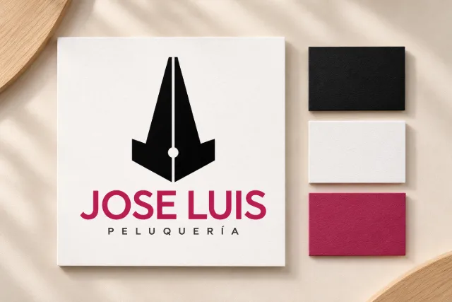
The Jose Luis Peluquería refresh builds on the original logo, retaining its most recognizable elements: the vertical black symbol and raspberry-coloured name. The intervention aims for a cleaner, more balanced presentation.
An evolution of the logo
The symbol has been refined to regularize its lines and balance its proportions. Updated typography provides a more consistent reading, accompanied by the descriptor “PELUQUERÍA”. Removing the black border gives the composition more space and greater flexibility across applications.
The identity in the space
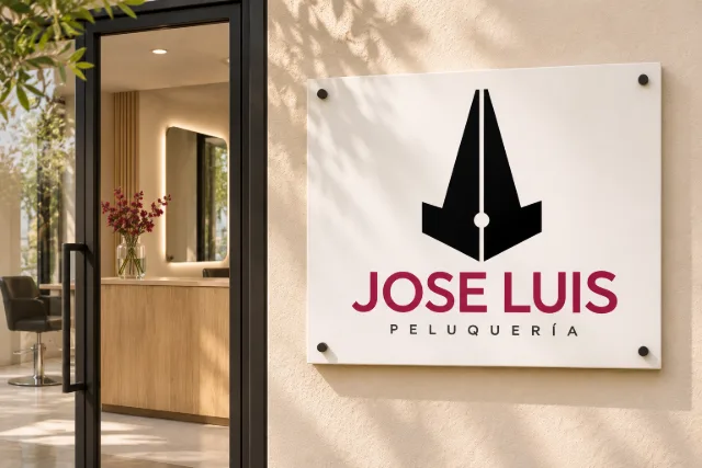
The signage concept places the logo on a white panel beside the salon entrance. Light tones and wood complement black and raspberry in a warm visual direction.
Details that connect the brand
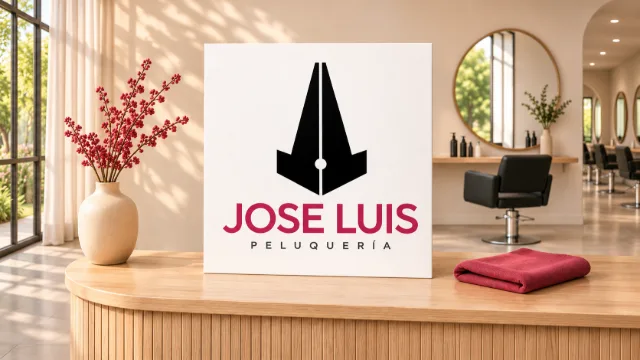
A presentation piece and a textile label explore different scales of use. The complete logo identifies the brand on paper, while the standalone symbol offers a more understated presence on salon materials.
The refresh and its applications are design proposals. The images are conceptual visualizations for the studio’s portfolio.