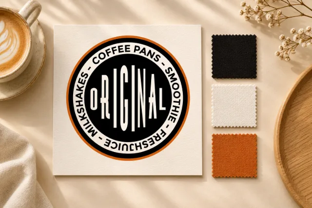
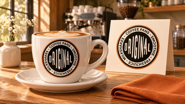
Original Coffee Pans is presented in the studio’s portfolio through its logo and a series of conceptual applications inspired by coffee culture. The circular seal brings together the name and beverage references in a compact composition.
A seal led by typography
The word “ORIGINAL” takes centre stage through narrow letters of varying heights. Text follows the outer ring to frame the composition, while a burnt-orange border adds warmth to the black-and-white contrast.
The identity on packaging
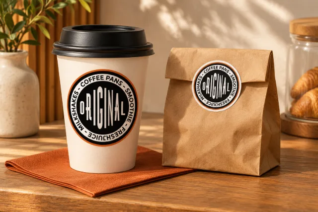
The takeaway concept applies the seal to a cup and a closing sticker for a paper bag. Repeating the circular element connects both items and keeps the logo as the focal point.
A recognizable presence in the space
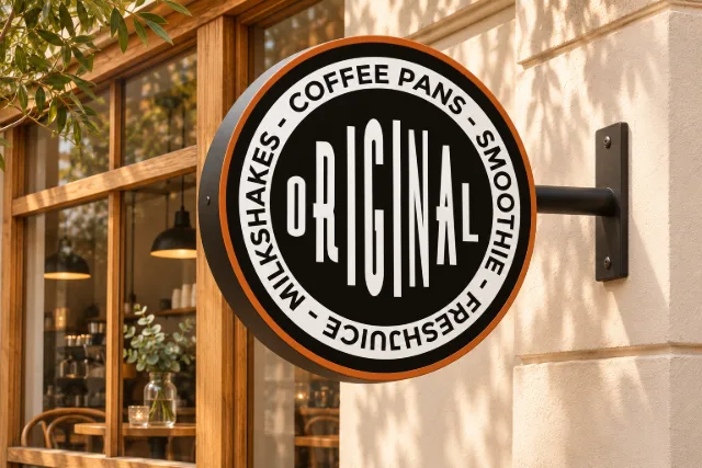
The seal’s shape translates into a round projecting sign. The concept pairs its orange rim and black bracket with a light facade and wood, exploring a warm presence for a café setting.
The images are conceptual visualizations created to present the project; they do not document manufactured products or an actual venue.